

The greater the simplicity, the greater the understanding (From Machines Are the Easy Part)
 From Machines Are the Easy Part; People Are the Hard Part.
Illustrations by Brady Johnson
36. The greater the simplicity, the greater the understanding.
Each time you add a “step” you confuse an additional 10% of your audience*. If you have a class of 10, when the first person gets to Step 10, I guarantee there will still be someone on Step 1.
There are 3 easy steps you can take to overcome this:
- Design a graphic that serves as a map.
- Distribute recipe-type handouts for those who fall behind to follow.
- Never have more than 3 steps.
If you have more than 3 steps, divide the task into multiple tasks.
Look hard at what you are trying to teach and distill the important stuff from the “nice to know” stuff or “I know more than you do, ain’t I hot?” stuff. Teach the important stuff and let folks figure out the rest on their own.
* Remember that 86% of statistics are made up.
37. Graphics rule!

There are more visual learners than meet the eye. (Sorry, couldn’t resist.)
A good, even simple, graphic can go a surprisingly long way in increasing understanding of a concept.
Dr. Gary Hartzell, author of Building Influence for the School Librarian, uses a simple graphic of a ribbon like you’d find on a prize-winning hog at the state fair on presentation slides that have key points. I see the ribbon; I write the point down. It works.
38. You can put all the pretty clothes on your dog you want, but he's still a dog.
PowerPoint, GoogleSlides, and other multimedia presentation tools are dangerous devices. Users, especially students, have a tendency to spend way too much time on a presentation’s appearance rather than its content. Popular speaker and author Jamie McKenzie calls this “power-pointlessness.”
Good assessment tools for presentations describe three components:
- How good is the content?
- How effective is the speaker?
- Did the technology help the message?
Lots more points should be given to the first two areas than the last.
There are many good sources about giving effective multimedia presentations. I am just picking a few things that really grind my gears. And these are things both high-priced speakers and third graders often do. Thanks for letting me vent.
39. First Law of Presentations: Show your audience pictures of happy, productive children and they will believe almost anything you tell them.
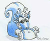
I hate clip art, especially clip art I’ve seen about a million times.
Like this one for example:

Illustrate your slides with pictures of actual happy, smilin’, gettin’-educated children taken with a digital camera. If you’re worried about parental permission, run the picture through a photo-editing filter until the individual is unrecognizable. You’ll even look talented.
Or find a student with a knack for cartooning and buy the work.
 Doug Johnson

Reader Comments